Как добавить текстуру в Adobe Illustrator
 Cathy Daniels
Добавление текстуры может вывести вашу работу на новый уровень. Я имею в виду не просто фоновое изображение с текстурой. Конечно, это можно сделать и так, но в Adobe Illustrator можно добавлять векторные текстуры и с панели Swatches.
В этом уроке я покажу вам три различных способа добавления текстуры к объекту в Adobe Illustrator.
Примечание: скриншоты из этого руководства взяты из версии Adobe Illustrator CC 2022 Mac. Версия для Windows или других версий может выглядеть иначе.
Я буду использовать одно и то же изображение на протяжении всего урока, чтобы вы могли увидеть различные результаты, полученные разными способами.

Это вектор, поэтому части можно разделить. Также было бы неплохо разделить цвета по разным слоям, если вы не хотите добавлять текстуру ко всему изображению.
Небольшой совет: Вам может понадобиться Вставить на место действие несколько раз во время процесса, вы можете использовать комбинацию клавиш Команда (или Ctrl для Windows) + Смена + V чтобы приклеить на место.
Метод 1: Наложение текстуры
Это самый простой метод добавления текстуры к фоновому изображению, поскольку все, что вам нужно сделать, это разместить изображение и изменить его режим смешивания.
Шаг 1: Создайте новый слой, разместите и внедрите в него изображение текстуры.
Например, я собираюсь смешать это текстурное изображение, чтобы добавить текстуру к синей области.
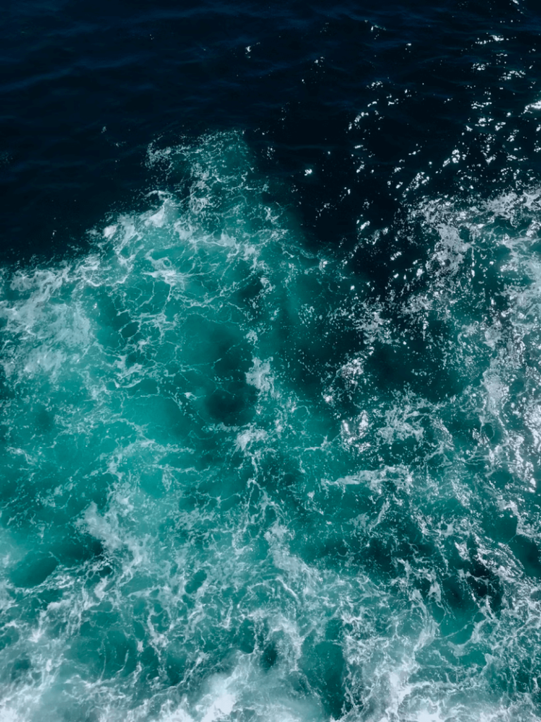
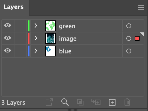
Шаг 2: Расположите изображение над синим цветом и под зеленым. Если вы разделили цвета ранее, просто перетащите зеленый слой над слоем изображения на панели слоев.
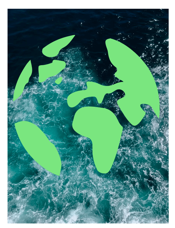
Это должно выглядеть следующим образом.
Шаг 3: Выберите слой с изображением, перейдите к Свойства > Внешний вид панель, нажмите Непрозрачность, и выберите режим смешивания.
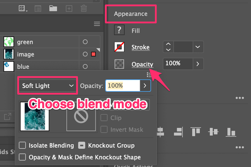
Вы можете попробовать несколько, чтобы понять, какой из них вам больше нравится. Я думаю, что Мягкий свет выглядит хорошо.

Шаг 4: Скопируйте синий слой и вставьте его на слой с изображением. Синий должен быть поверх изображения.
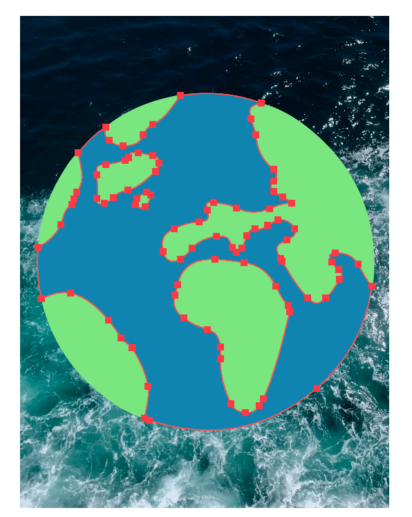
Выберите изображение и синий цвет и нажмите комбинацию клавиш Команда + 7 чтобы создать обтравочную маску.

Шаг 4 необязателен, если вы применяете текстуру ко всему изображению.
Метод 2: Добавление эффектов
Это самый простой способ добавить текстуру к объектам, потому что есть несколько предустановленных текстурных эффектов (из Photoshop Effects), которые можно использовать в Adobe Illustrator.
Поскольку мы уже добавили текстуру к воде (синяя область), теперь давайте воспользуемся предустановленными эффектами, чтобы добавить текстуру к зеленой части.
Шаг 1: Выберите объект, к которому нужно добавить текстуру. В данном случае я выберу все на зеленом слое, нажав на целевой круг.
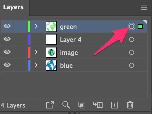
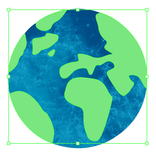
Шаг 2: Перейдите в верхнее меню Эффект > Текстура и выберите одну из текстур из предложенных вариантов. Вы можете выбрать одну из шести текстур.
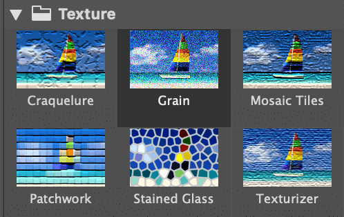
Например, я выбрал Mosaic Tiles, и это выглядит следующим образом.
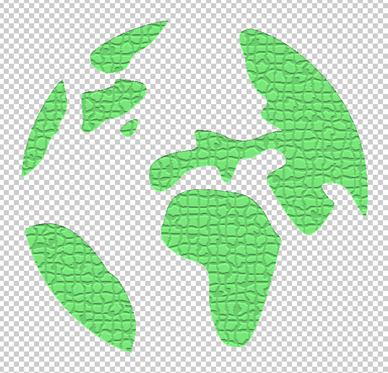
Я знаю, это не очень естественно, поэтому следующим шагом будет корректировка текстуры.
Шаг 3: Настройте параметры текстуры. Не существует строгого стандарта по значению каждого параметра, поэтому, в основном, вы будете просто перемещать ползунки, пока не получите удовлетворительный результат.
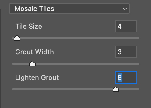
Я думаю, что пока все выглядит нормально.
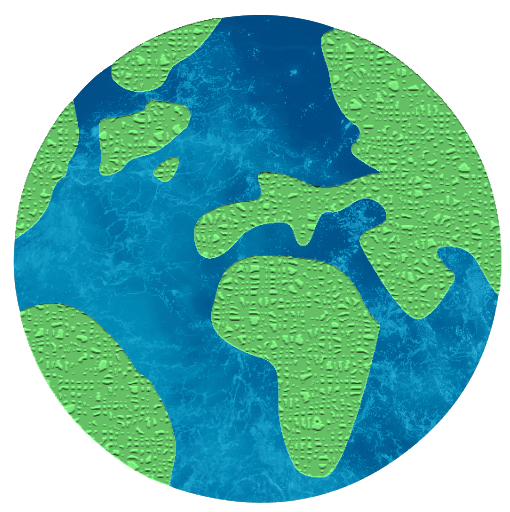
Вы также можете уменьшить непрозрачность, чтобы лучше смешать текстуру.

Метод 3: Образцы текстур
Вы можете найти некоторые образцы векторных текстур в разделе Swatches панель.
Шаг 1: Откройте панель Swatches из верхнего меню Окно > Swatches .
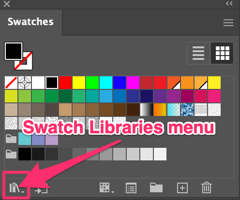
Шаг 2: Нажмите Меню Swatch Libraries > Узоры > Основы графики > Базовая графика_текстуры .

Откроется отдельная панель с образцами текстур.
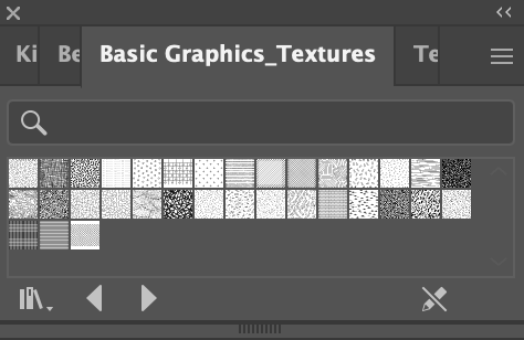
Шаг 3: Выберите объект, к которому нужно добавить текстуру, и выберите текстуру из списка текстур.
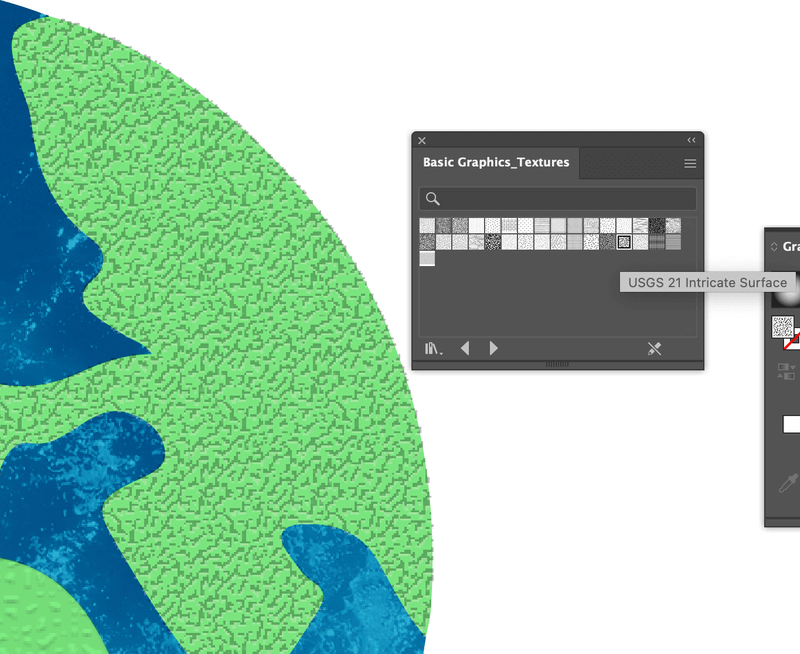
Выбранная вами текстура отобразится на панели Swatches.
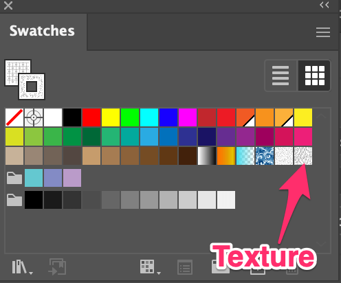
Вы можете выбрать режим смешивания или уменьшить непрозрачность, чтобы текстура лучше смешивалась.
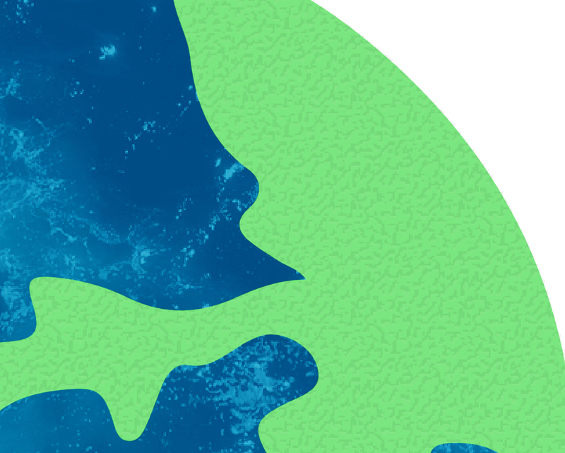
Совет: Вы можете редактировать эти текстуры, поскольку они являются векторными узорами. Дважды щелкните по выбранной текстуре на панели Swatches, и вы сможете изменить ее размер, цвет и т.д.
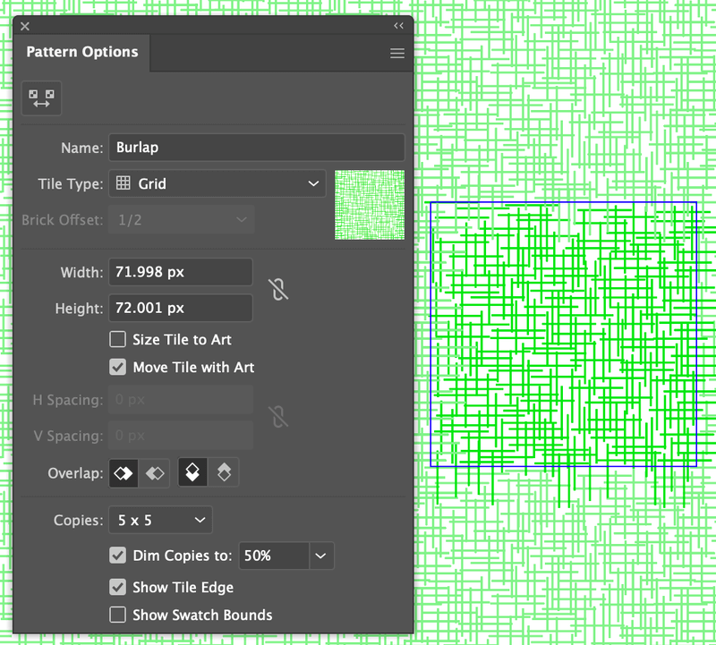
Итак, какой эффект вам нравится больше?

Подведение итогов
Вы можете легко добавить текстуру к своему дизайну, используя любой из приведенных выше методов. Я бы сказал, что метод 1 сложнее, но вы можете получить желаемую текстуру, выбрав правильное изображение. Метод 2 и 3 требуют некоторой настройки, то есть регулировки параметров.
Честно говоря, я всегда смешиваю эти методы и очень довольна результатами. Надеюсь, этот урок поможет вам добавить текстуры в ваш дизайн!
Paper Texture in Illustrator

Paper Texture is one of its best feature, which helps in a different type of graphic designing work. Paper Texture Illustrator is referred to as the illustration, which uses a natural feel of real-world paper effect and helps you understand the purpose of that particular illustration. With Paper Texture, you can make highly professional illustration work and use it as a base idea of any theme-oriented graphics.
Here in this article, we will understand ‘What is Paper Texture Illustrator?’ and learn ‘How to apply Paper Texture in illustrator?’ with a very simple and exciting example. You can use this paper texture idea for your project work for making your project effective.
3D animation, modelling, simulation, game development & others
How to Create Paper Texture in Illustrator?
Is this a big question for you? Now don’t worry about the answer to this question it will be no more question for you after this article. You just have to stay with this article, and you will find an easy way for this problem at the end of the article. Now let us start our learning of creating paper texture with few simple steps. The steps are as follows.
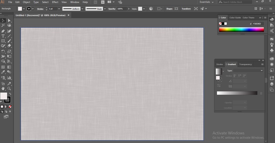
Step 1: Go to the File Menu of a Menu bar at the top of the working screen of the illustrator. Choose the ‘New’ Option from the drop-down list for making the ‘New’ document in this software.

Step 2: Now go to the tool panel section, which is on the left side of the working screen of this software, and choose the Rectangle tool from the list of the tool panel.
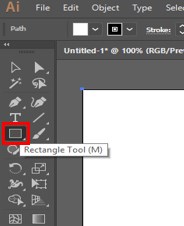
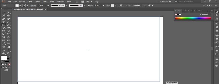
Step 3: Make a rectangle with the help of this rectangle tool of this software. Make sure the rectangle will fully cover the area of the document.
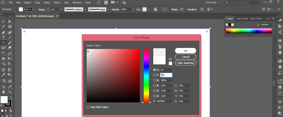
Step 4: Now click on the Fill Color box of this rectangle which is at the bottom end of the tool panel section. A Color Picker box will be open. Choose 2% black color in combination with white color that is a light grey color. You can choose any other color for the texture of your paper.
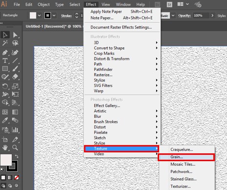
Step 5: Go to the Effect Menu of the Menu bar, which is at the top of the working area. A drop-down list will be open. Go to the Texture option of this list and choose the Grain option from the new drop-down list.
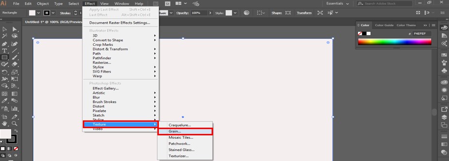
Step 6: The grain box of texture option will be open when you click on the Grain option of the drop-down list.
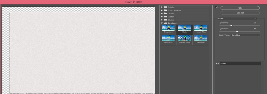
Step 7: Here in the Grain option of Texture effect, we have many different types of options. Click on the drop arrow of the grain option. A drop-down list will be open here. Choose ‘Note Paper’ style of grain effect by click on it.
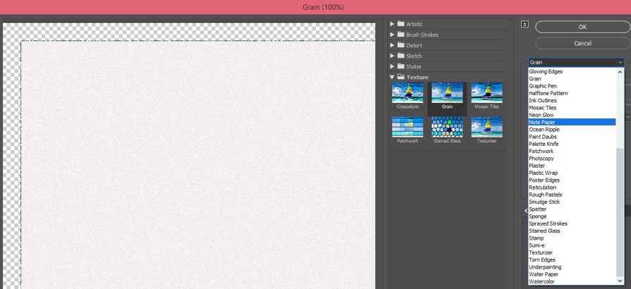
Step 8: When you select the ‘Note Paper’ option, the texture of the paper will appear in your document area. For enhancing the detailing of this texture, we will make some settings in the parameter of this option.
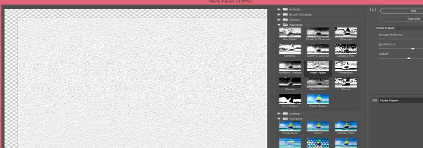
Step 9: Let us make some changes in the parameter of this option. Make the ‘Image Balance’ value up to 47 for the natural effect of the texture of the paper.
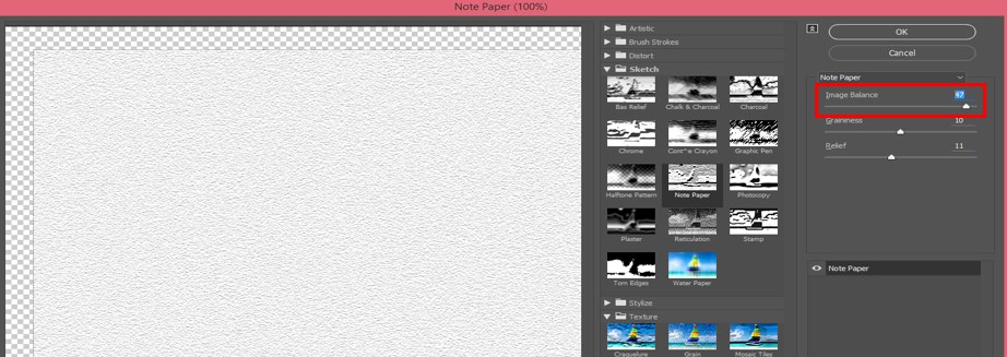
Step 10: Now make the value of ‘Graininess’ up to 6. Graininess means the density of grain in any texture. If the value of graininess is less, then the density of the grain will be less.
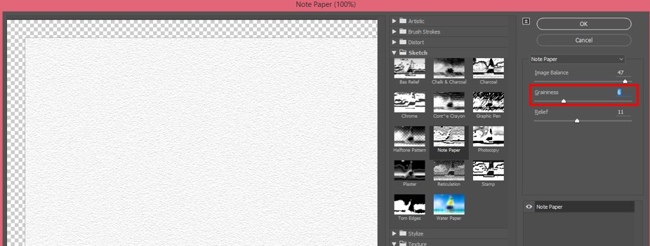
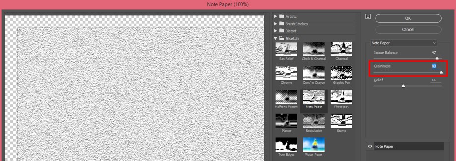
Step 11: And when you increase the value of this property, the density of the grain will be increased, and the texture will look like this. You can adjust the value of graininess according to you, which suits your desired texture.
Step 12: The next parameter is of the ‘Note Paper’ style is Relief. You can increase and decrease the value of Relief according to you. Relief lightens or darkens the detailing of grain structure when you increase and decrease its value.
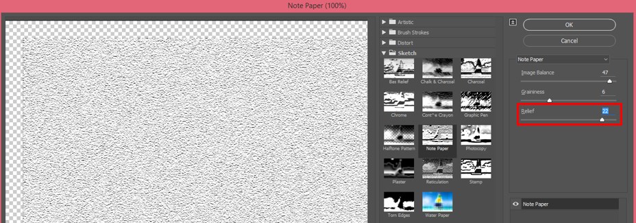
Step 13: This is the final paper texture of the Note Paper style. Now you can use this paper texture in your illustration or graphics designing work and make an effective project with these features.
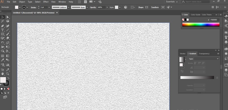
Step 14: Now, I will introduce you to one more paper texture style. You can also use this style as a paper texture in adobe illustrator, the Water Paper style. Again, for Water paper style, go to Effect Menu of Menu bar and go to Texture in a drop-down list. Choose the Grain option again.
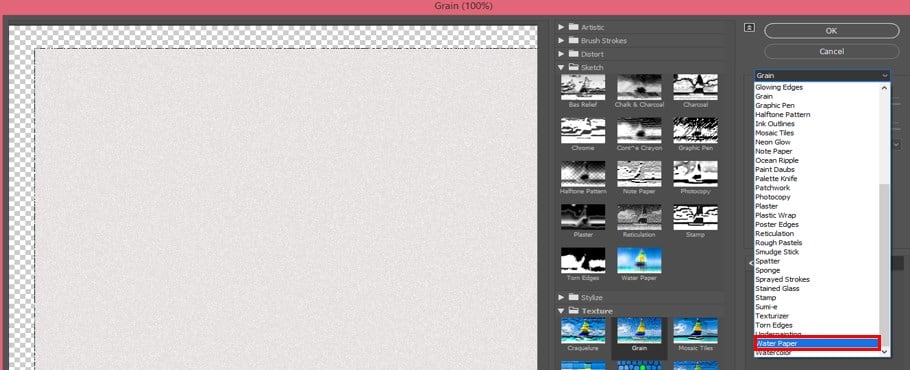
Step 15: Now click on the down arrow key of the Grain style option and Choose Water Paper style from the drop-down list.
Step 16: We also have some parameters in this texture. Fiber Length is one of the important properties of this style. When you decrease the value of Fiber Length, the fiber mark on paper will look like randomly arranged.
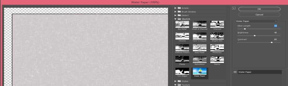
Step 17: When you increase the value of Fiber Length, it will give a smooth structure to the paper like this.
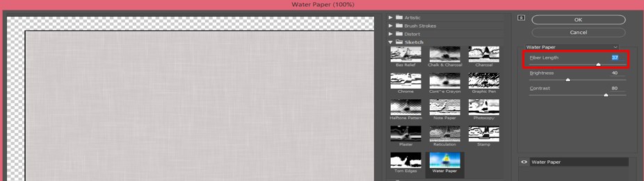
Step 18: You can set the brightness of this style according to you. The appearance of the color of paper becomes light when you increase the value of Brightness.
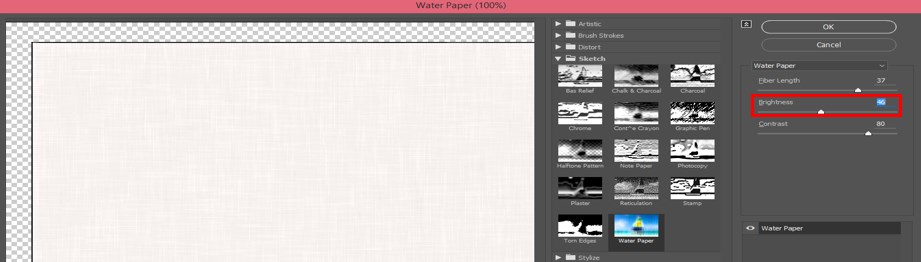
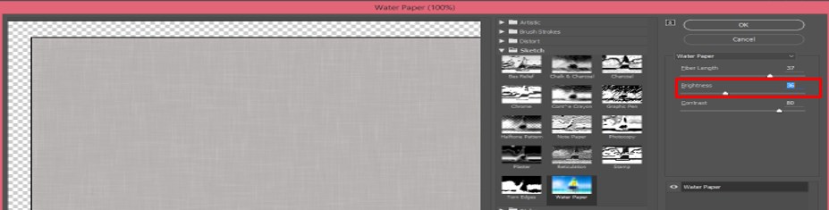
Step 19: And when you decrease the value of Brightness, it will give you darken appearance.
Step 20: The third one is Contrast. Contrast increases and decreases the smoothness of the color of the paper. By changing the value of the Contrast, you can adjust it according to your requirement.
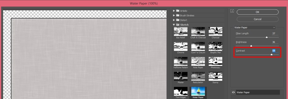
Step 21: This is the final Water paper texture. You can also use this texture as the base of any artwork and utilize its quality to enhance the appearance of your work.
In this way, you can add paper texture in your graphics work of adobe illustrator software. You can make your own paper texture with the help of some tools and features of this software. By adding paper Texture to your work, you can manipulate it with your own ideas.
Conclusion
After this article, now you know about Paper Texture illustrator, and you can use it in your graphics work to make your work more effective for its real purpose. You can have command of this feature of illustrator by analyzing all aspects of this feature.
Recommended Articles
This is a guide to Paper Texture in Illustrator. Here we discuss the Introduction and how to create Paper Texture in Illustrator with its Aspects and Features. You can also go through our other related articles to learn more –
How to Use Paper Textures in Illustrator
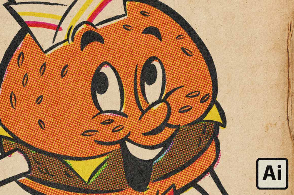
Not sure how to best use your new paper textures? We’re here to help!
Follow the video below for step-by-step instructions on how to use paper textures in Adobe Illustrator. We will be using the Paper Boy paper textures that come with every purchase of the ColorLab Comic Color Kit.
Can’t Watch the Video? Here’s what you missed
- Open a paper texture in Illustrator. The paper texture and effects are in a folder in the layers panel. You will color on the yellow, red, blue, and black layers which are already set to Multiply.
- Be sure to add any new layers below the paper and effects folder. Add your artwork by: (A) selecting a pen brush and beginning to draw. (B) select File>Place and add in a sketch to trace or color in.
- Adjust the texture depth by clicking the Adjustments icon on that layer. Now open the Adjustments Panel. Adjust the Opacity slider until you get your desired texture depth.
- Adjust the ink effects by clicking the Adjustments icon on that layer. Now open the Adjustments Panel. Adjust the Opacity slider until you get the desired ink effects.
Be sure to check out the ColorLab Color Chart if you ever need help formulating colors.
Как наложить текстуру бумаги в иллюстраторе
By Preeti Prajapati
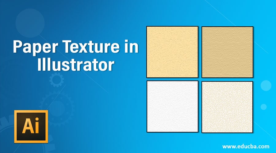
Introduction to Paper Texture in Illustrator
Paper Texture is one of its best feature, which helps in a different type of graphic designing work. Paper Texture Illustrator is referred to as the illustration, which uses a natural feel of real-world paper effect and helps you understand the purpose of that particular illustration. With Paper Texture, you can make highly professional illustration work and use it as a base idea of any theme-oriented graphics.
Here in this article, we will understand ‘What is Paper Texture Illustrator?’ and learn ‘How to apply Paper Texture in illustrator?’ with a very simple and exciting example. You can use this paper texture idea for your project work for making your project effective.
3D animation, modelling, simulation, game development & others
How to Create Paper Texture in Illustrator?
Is this a big question for you? Now don’t worry about the answer to this question it will be no more question for you after this article. You just have to stay with this article, and you will find an easy way for this problem at the end of the article. Now let us start our learning of creating paper texture with few simple steps. The steps are as follows.
Step 1: Go to the File Menu of a Menu bar at the top of the working screen of the illustrator. Choose the ‘New’ Option from the drop-down list for making the ‘New’ document in this software.
Step 2: Now go to the tool panel section, which is on the left side of the working screen of this software, and choose the Rectangle tool from the list of the tool panel.
Step 3: Make a rectangle with the help of this rectangle tool of this software. Make sure the rectangle will fully cover the area of the document.
Step 4: Now click on the Fill Color box of this rectangle which is at the bottom end of the tool panel section. A Color Picker box will be open. Choose 2% black color in combination with white color that is a light grey color. You can choose any other color for the texture of your paper.
Step 5: Go to the Effect Menu of the Menu bar, which is at the top of the working area. A drop-down list will be open. Go to the Texture option of this list and choose the Grain option from the new drop-down list.
Step 6: The grain box of texture option will be open when you click on the Grain option of the drop-down list.
Step 7: Here in the Grain option of Texture effect, we have many different types of options. Click on the drop arrow of the grain option. A drop-down list will be open here. Choose ‘Note Paper’ style of grain effect by click on it.
Step 8: When you select the ‘Note Paper’ option, the texture of the paper will appear in your document area. For enhancing the detailing of this texture, we will make some settings in the parameter of this option.
Step 9: Let us make some changes in the parameter of this option. Make the ‘Image Balance’ value up to 47 for the natural effect of the texture of the paper.
Step 10: Now make the value of ‘Graininess’ up to 6. Graininess means the density of grain in any texture. If the value of graininess is less, then the density of the grain will be less.
Step 11: And when you increase the value of this property, the density of the grain will be increased, and the texture will look like this. You can adjust the value of graininess according to you, which suits your desired texture.
Step 12: The next parameter is of the ‘Note Paper’ style is Relief. You can increase and decrease the value of Relief according to you. Relief lightens or darkens the detailing of grain structure when you increase and decrease its value.
Step 13: This is the final paper texture of the Note Paper style. Now you can use this paper texture in your illustration or graphics designing work and make an effective project with these features.
Step 14: Now, I will introduce you to one more paper texture style. You can also use this style as a paper texture in adobe illustrator, the Water Paper style. Again, for Water paper style, go to Effect Menu of Menu bar and go to Texture in a drop-down list. Choose the Grain option again.
Step 15: Now click on the down arrow key of the Grain style option and Choose Water Paper style from the drop-down list.
Step 16: We also have some parameters in this texture. Fiber Length is one of the important properties of this style. When you decrease the value of Fiber Length, the fiber mark on paper will look like randomly arranged.
Step 17: When you increase the value of Fiber Length, it will give a smooth structure to the paper like this.
Step 18: You can set the brightness of this style according to you. The appearance of the color of paper becomes light when you increase the value of Brightness.
Step 19: And when you decrease the value of Brightness, it will give you darken appearance.
Step 20: The third one is Contrast. Contrast increases and decreases the smoothness of the color of the paper. By changing the value of the Contrast, you can adjust it according to your requirement.
Step 21: This is the final Water paper texture. You can also use this texture as the base of any artwork and utilize its quality to enhance the appearance of your work.
In this way, you can add paper texture in your graphics work of adobe illustrator software. You can make your own paper texture with the help of some tools and features of this software. By adding paper Texture to your work, you can manipulate it with your own ideas.
Conclusion
After this article, now you know about Paper Texture illustrator, and you can use it in your graphics work to make your work more effective for its real purpose. You can have command of this feature of illustrator by analyzing all aspects of this feature.
Recommended Articles
This is a guide to Paper Texture in Illustrator. Here we discuss the Introduction and how to create Paper Texture in Illustrator with its Aspects and Features. You can also go through our other related articles to learn more –
Quick Tip: How to Create a Grunge Paper Texture Graphic Style in Illustrator

Sharon Archer-Thomas Last updated Mar 19, 2013


I love adding texture to my illustrations, but creating a texture from nothing is always hard, so learning how to manipulate the different tools and default resources in Adobe Illustrator you already have, can work in your favor. Today I’m going to show you how to create a grunge paper texture Graphic Style, starting with a humble default Art Brush, then using the Pattern Options of CS6 and then some fun with the Appearance panel. So let’s jump in!
Step 1
Let’s start by taking advantage of one of the Art Brushes you get by default in Adobe Illustrator. In the Brushes panel go into the drill down menu and select Open Brush Library > Artistic > ChalkCharcoalPencil. Select the top brush which is called «Chalk» and apply it along a horizontal line drawn by the Line Segment Tool (\).


Step 2
While the line is selected, go to Object > Pattern > Make. This will open the Pattern Options screen and will automatically expand the art brush applied to the line to shapes. However, there is a slight issue. all the shapes are in group, upon group, upon group, upon.


So select the group and Object > Ungroup until you’re left with the below.


Step 3
Let’s give the pattern a name, here I’m using the inspiring name «Texture Pattern» and then set the Tile Type to Hex by Row.


Then play with the Width and Height values to bunch up the shapes so there are minimal large gaps.


Step 4
The problem with using this technique to create a texture pattern is the larger shapes make it more obvious it’s a pattern and not the subtle texture you’re after. The best seamless textures avoid having these tell tale signs. Using the Direct Selection Tool (A), select the largest shapes and delete them.


Keep going until you’re happy with the look of the texture. I’ve taken away all the large shapes.


Step 5
If you delete too many shapes, you could always select a group of them and duplicate them through out. This is what I’ve done with my texture. With this method, you not only fill in your texture more, but also make it more unique. So use the Lasso Tool (Q) to select some shapes.


The hold Alt + drag to duplicate the shapes and place them where you wish. Do this several times until you’re happy with the texture density.


Step 6
Select All of the shapes (Ctrl + A) and then give the fill a dark brown shade. Using a black fill makes it impossible to use Blending Mode Screen, however with an off black shade this is avoided. As we’re aiming for a grunge paper look, brown is a good choice. When you’re happy with your pattern, click on Done and it will save it to your Swatches panel.


Step 7
Let’s construct the Graphic Style. Fill a Rectangle (M) with an off grey/beige and then go into the Appearance panel. Click on the drill down menu and select New Fill and apply your «Texture Pattern». Change the Blending Mode to Screen.


While the pattern fill is selected, go to Object > Transform > Rotate and rotate the pattern slightly with only the Transform Patterns box ticked.


Step 8
Add a New Fill again and apply your «Texture Pattern». This time set it to Blending Mode Multiply and Opacity 5%. As you’ve added a new fill, the pattern will be applied in it’s normal orientation. As the pattern is angled different to each other, you’ll create this multi-tone texture effect.


I’ve then went to finish the texture using an inverted transparent black radial gradient to create a vignette effect and then I added a new fill using another pattern. You can access this by going into the Swatches panel and going into the drill down menu, Open Swatch Library > Patterns > Basic Textures and selecting the Diamond texture. Set both of these new fills to Blending Mode Multiply, Opacity 5%.


Conclusion
When you’re happy with your overall texture, you can go into the Graphic Styles panel and click on the New Graphic Style button. You can then apply it in future projects, as general textures in illustrations or as a great background in your designs.
What’s great about this texture Graphic Style is that it’s 100% vector, so it’s still scalable and without any raster effects. If this is your thing and you want to try out more ways of achieving scalable textures in Adobe Illustrator, why not check out one of my old tutorials on «Creating Scalable Textures within Illustrator». I also highly recommend this tutorial on creating a seamless grunge pattern using Live Trace. Until next time, happy vectoring!
Эффект рваной бумаги в Illustrator
Сегодняшний урок мы посвятим созданию эффекта рваной бумаги используя простые инструменты иллюстратора.
Создаем прямоугольник без обводки и светло-серой заливкой.

Выбираем инструмент «Деформация» (Shift+R). Вызываем меню настроек инструмента дважды нажав на него. Параметры устанавливаем указанные на фото.

Используя инструмент деформируем край нашего прямоугольника в произвольном порядке, тем самым создавая эффект разрыва.

Копируем наш элемент и помещаем его вперед (Ctrl+C и Ctrl+F). К новому элементу применяем градиент, можем оставить белую заливку или сделать ее любым цветом.

Используя деформацию изменяем контур нашего верхнего слоя.

Копируем нижний слой и вставляем его на задний план. Делаем заливку темно серой.

Копируем наш нижний слой и вставляем его назад, делаем заливку белой и используя стрелки на клавиатуре сдвигаем его немного ниже.

Выделяем наши два нижних слоя и делаем переход.

После этого открываем панель настроек перехода и указываем желаемое число переходов для наших слоев.

Устанавливаем для нашего перехода значение умножение на панели непрозрачности.

Придадим нашей бумаге более естественного эффекта разрыва. Для этого выбираем инструмент «Морщины».
Урок создания текстуры мятой бумаги
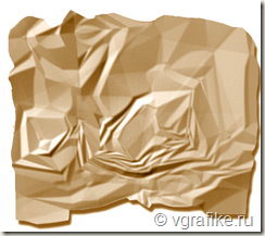
Текстура мятой бумаги с успехом используется в веб-дизайне и скрабукинге.
Создайте новый файл, немного больше, чем вы хотите получить текстуру мятой бумаги. Для этого урока размер не имеет значения. Режим RGB, фон белый.
Создайте новый слой.
Настройте параметры градиента (Gradient)
Рисуем градиентом.
Перетаскивайте градиент по документу из разных точек, сторон, выбирая произвольное направление. Чем больше вы проведете таких хаотических линий при помощи градиента, тем эффектнее будет текстура мятой бумаги в итоге.
Эффект мятой бумаги
Filter> Stylize> Emboss (Фильтр –> Стилизация –> Тиснение) . Выберите угол, падения света на бумагу, а также степень “мятости бумаги”, поиграв с настройками Высота (Height) и Эффект (Amount).
Мне нравится результат мятой бумаги, который получается при настройках тиснения в 2-5 пикселей по высоте и эффекта в 200-300%.
Коррекция эффекта мятой бумаги с помощью кривых и уровней.
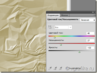
Отредактируйте полученную текстуру мятой бумаги при помощи уровней и кривых. И вы можете покрасить бумагу с Hue / Saturation. Вы можете добраться до них в Image –> Adjustments –> Hue / Saturation (Изображение –> Коррекция –> Цветовой тон / Насыщенность). Не забудьте поставить галочку напротив тонирования при изменении цветового тона текстуры.
Создаем рваный край текстуре мятой бумаги.
С помощью Polygonal Lasso Tool (инстумента магнитное лассо) , создайте рваный край мятой бумаги.
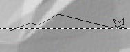
После того, как вы обведёте по краю текстуру мятой бумаги, нажмите кнопку добавления маски слоя внизу палитры слоев при активном слое paper.
Создание тени.
Создайте тень от, нажав на кнопку внизу палитры слоев. Выберите Тень (drop shadow) в параметрах наложения слоев.