User interface themes
The interface theme defines the appearance of windows, dialogs, buttons, and all visual elements of the user interface. By default, CLion uses the Darcula theme, unless you changed it during the first run.
The interface theme is not the same as the color scheme, which defines the colors, fonts, and syntax highlight for various text resources: the source code, search results, and so on.
Change the UI theme
In the Settings dialog ( Control+Alt+S ), select Appearance & Behavior | Appearance .
Select the UI theme from the Theme list:
IntelliJ Light : Traditional light theme for IntelliJ-based IDEs
macOS Light or Windows 10 Light : OS-specific light theme available as a bundled plugin
Darcula : Default dark theme
High contrast : Theme designed for users with color vision deficiency
Select Sync with OS to let CLion detect the current system settings and use the default dark or light theme accordingly. If your OS is set up to auto-switch between day and night modes, the IDE will automatically toggle between light and dark themes too.
It is also possible to create your own UI themes for CLion and customize the built-in themes. For more information, refer to IntelliJ Platform SDK Documentation.
Productivity tips
Use the quick switcher
Press Control+` or select View | Quick Switch Scheme from the main menu.
In the Switch popup, select Theme , and then select the desired interface theme.
Change the color scheme
In this procedure, we will customuize the color scheme of the code in CLion. programmers usually prefer to have their own customized colors for the code they write in their IDEs for different reasons. By the end of this procedure you should be able to change the color scheme of your code.
Instructions
-
Open CLion application.
Click Configure.

Click Preferences.

You should now be at the [preferences window].
Click Editor.

Click Color Scheme.

Click C/C++.

You should now be at the [color scheme window].
Select the element you want to change.
* The code box at the bottom is interactive. When clicking on any element it will be selected for modification.

Select the element property you want to change.

Select your desired color and click Choose.

To save your changes, click OK.

Congratulations! You have successfully changed your color scheme. Next, perform the success check below. If you have any issues, check out troubleshooting.
✓ All the changes you made should now be v in your code.
Copyright © 2017-2019 Patrick Marsceill. Distributed by an MIT license.
Appearance
Use this page to change the overall look and feel of your IDE.
Select the UI theme from the list. By default, you can choose between a light, a dark, and a high-contrast theme. You can install other themes as plugins. For more information, refer to User interface themes.
Select this checkbox to let CLion detect the current system settings and use the default dark or light theme accordingly.
Sync with OS is not supported on Linux.
Use this selector to zoom in and out the entire IDE, increasing or decreasing the size of all UI elements at once.
You can also access this setting from the main menu: select View | Appearance | Zoom IDE .
Use custom font
Specify custom font family and size to use in the CLion UI.
For more information, refer to User interface themes.
Accessibility
Support screen readers
Enable screen reader support for CLion. For more information, refer to Accessibility.
Use contrast scrollbars
Make the editor scrollbar more visible.
Adjust colors for red-green vision deficiency
Adjust UI colors to better perceive colors in case of protanopia and deuteranopia.
For more information about configuring accessibility options, refer to Accessibility.
UI Options
Show tree indent guides
Display vertical lines that mark indent levels in tree views, for example, in the Project tool window. These lines can help you better understand the hierarchy of the components in your project.
Use smaller indents in trees
Decrease the amount of space between the tool window border and the text in tree views, for example, in the Project tool window.
Enable mnemonics in menu
Underline hotkeys that you can press to execute a menu action
Enable mnemonics in controls
Underline hotkeys that you can press to use controls in dialogs
Use project colors in main toolbar
Use colored headers to simplify navigation between several open projects. For more information, refer to Configure the toolbar color.
Scroll the UI smoothly, pixel-by-pixel, instead of line-by-line.
This also enables animated smooth scrolling for Windows and Linux by default. You can disable it to use precise scrolling instead: press Control+Shift+A , find and open the Smooth Scroll Options dialog, and disable the Animated smooth scrolling checkbox.

In this dialog, you can also set the duration of the scroll animation and change the appearance of the animation based on https://cubic-bezier.com/#.17,.67,.83,.67.
Drag-and-drop with Alt pressed only
Avoid accidentally moving files, editor tabs, tool window buttons, and other UI components. When enabled, hold the Alt key to move things around.
By default, this option is disabled and you can move everything without any extra keys.
Always show full path in window header
Show the full path to the project and to the current file in the main window header. When disabled, the header will show only the name of the project and file.
Display icons in menu items
Show icons to the left of the items in the main menu and context menus.
Configure a custom background image for the IDE.
Antialiasing
Select which antialiasing mode you want to apply to the IDE (including menus, tool windows, and so on):
Subpixel : this option is recommended for LCD displays and takes advantage of the fact that each pixel on a color LCD is composed of red, green and blue sub-pixels. This allows smoothing text and rendering it with greater detail.
Greyscale : this option is recommended for non-LCD displays or displays positioned vertically. It deals with text at the pixel level.
No antialiasing : this option can be used for displays with high resolution, where non-antialiased fonts are rendered faster and may look better.
Select which antialiasing mode you want to apply to the editor:
Subpixel : this option is recommended for LCD displays and takes advantage of the fact that each pixel on a color LCD is composed of red, green and blue sub-pixels. This allows smoothing text and rendering it with greater detail.
Greyscale : this option is recommended for non-LCD displays or displays positioned vertically. It deals with text at the pixel level.
No antialiasing : this option can be used for displays with high resolution, where non-antialiased fonts are rendered faster and may look better.
Tool Windows
Show tool window bars
Show the tool window bars around the edges of the main window. For more information, refer to Tool window bars and buttons.
Side-by-side layout on the left
Show the tool windows that are attached to the top and bottom edges on the left side in two columns. For more information, refer to Optimize for wide-screen monitors.
Side-by-side layout on the right
Show the tool windows that are attached to the top and bottom edges on the right side in two columns. For more information, refer to Optimize for wide-screen monitors.
Widescreen tool window layout
Optimize the layout of tool windows for wide-screen displays: maximize the height of vertical tool windows by limiting the width of horizontal tool windows. For more information, refer to Optimize for wide-screen monitors.
Remember size for each tool window
Remember individual width of every tool window when you reopen or switch between them.
When this option is disabled, tool windows have the unified default width, and their sizes remain constant when you switch between them.
Show tool window numbers
This feature is not available in the new UI.
Show tool window quick-access numbers on the tool window buttons.
You can hold the Alt key and press the corresponding number key to switch tool windows regardless of this setting: Alt+1 for the Project tool window, and so on.
15 Best CLion Themes
CLion is one of many JetBrains products. It is a cross-platform C and C++ IDE for operating systems like Linux, macOS, and Windows integrated with the CMake build system.
It is a fact that the earlier version of this IDE supports GNU Compiler Collection (GCC) and Clang compilers and GDB debugger, LLDB and Google Test.
It is not only C and C++ you can use with CLion, other programming languages like Kotlin, Python, Rust, Swift, etc. also work well with the IDE either directly or through a plugin.
Just like any other IDEs and other families of JetBrains products, CLion offers developers with wide options to customize their editing experience.
Follow us as we give you some really nice and cool Clion themes you can consider using for CLion while you code.
1. Material Theme UI
JetBrains IDEs like CLion, IntelliJ IDEA, WebStorm, Android Studio and much more use Material Theme UI as a plugin. It gives them the appearance and feel of material design.
The designer of this theme got inspiration from Material Theme for Sublime Text.

More Details
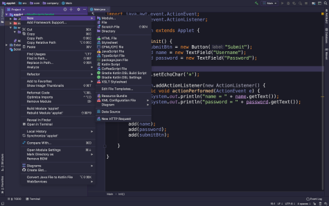
This dark theme looks cool and attractive. It appears very colorful and bright. It is a theme you should consider using as it is meant for everyone.
 More Details
3. IntelliJ Light
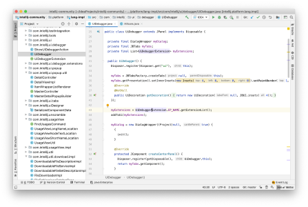
A light theme for CLion. It’s a unified theme that supports operating systems like Windows, macOS and Linux.
 More Details
4. One Dark Theme
From its name you can actually deduce that it’s a dark theme. The creator of this theme got inspiration from Atom-One-Dark-Theme.
 More Details
5. Dark Purple Theme
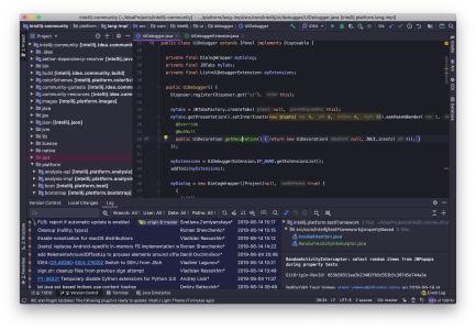
This is a dark theme with purple tones. You can consider it for your next project because of how cool and nice it appears.
 More Details
6. Darcula Theme
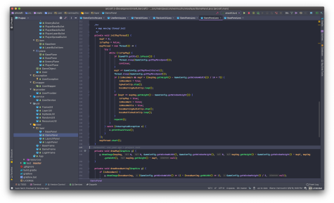
A dark theme for CLion and other JetBrains IDEs.
 More Details
This arctic, north-bluish theme can be used on CLion. It stands out among others because of its cleaniness and brightness.
The creator of this theme used Nord colour palette as a case study to make one for JetBrains products.
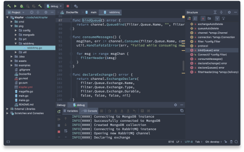 More Details
8. Visual Studio Code Dark Plus Theme
This is a dark colour theme for CLion and other fellow JetBrains IDEs. The theme is based on default Visual Studio Code “Dark Plus” theme.
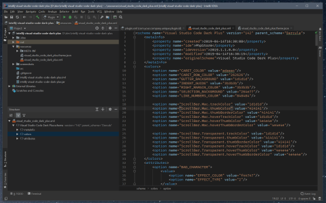 More Details
A dark Monokai theme for CLion, inspired by Dracula colour scheme.
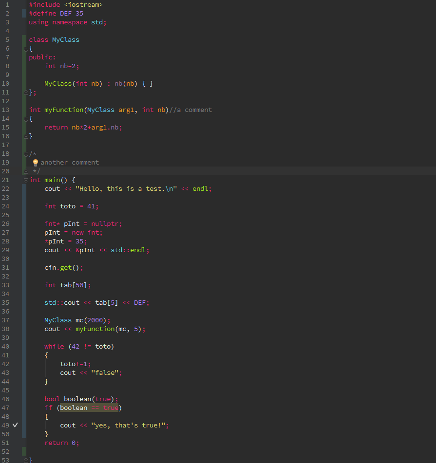 More Details
10. Cyan Light Theme
This light theme in cyan tones can be used on CLion.
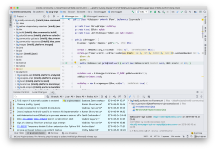
More Details
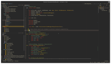
11. Gruvbox Theme
This is bright theme with pastel “retro groove” colours and light/dark mode is very easy on the eyes. This Gruvbox theme is based on badwolf, jellybeans and solarized.
More Details
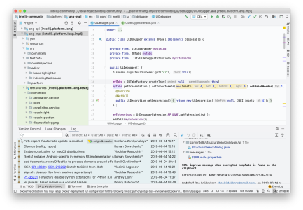
We know this as a low-contrast light theme. As it is shown in the image below, this theme make sure there’s a lot of gaps between text lines for easy readability of codes.
More Details
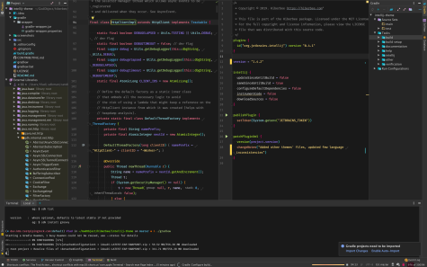
13. Hiberbee Theme
The bright colours and dark mode of this theme make it cool and nice. The creator based the design on Monokai Pro & MacOS Mojave.
More Details
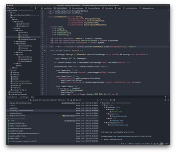
14. Spacegray Theme
A dark theme that can be used on CLion. The creator of this theme got inspiration from the Spacegray theme designed by Gadzhi Kharkharov for SublimeText.
More Details
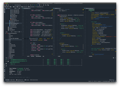
15. Vuesion Theme
A dark mode theme for CLion and other JetBrains IDEs. The creator got inspiration from vue project to design this nice theme.
More Details
This article has listed and explained to us some really nice themes that support CLion. Each of their respective descriptions is given to differentiate their uniqueness and provide us clue on the one we will prefer on our next project(s).